Key Aspects of Website Design: A Comprehensive Guide
Have you ever thought, how powerful a digital presence can be for professionals, businesses and non – profit organizations. A website is the first thing required for digital transformation – it’s a critical tool for engaging audiences and driving business growth. Website Design is the process of creating visually appealing, user-friendly websites that balance the look and functions required. From the colors and typography to the layout and interactive elements, every design choice plays a role in shaping how users perceive and interact with your brand. Infact, 75% of visitors judge your brand, by checking out your website.
However, website design goes beyond aesthetics. It involves understanding user behavior, optimizing for different devices, and ensuring a seamless experience across platforms. A well-designed website not only captures attention but also keeps visitors engaged, guiding them toward specific actions—whether it’s making a purchase, signing up for a newsletter, or exploring your services.
The attention span of audience has dropped to 8 seconds, so now you only have this much time to convince users to explore your products or services. Website design is one of the powerful ways to showcase your brand identity in such a way that it attracts users. Whether you’re building a static site to showcase your portfolio or a dynamic e-commerce platform, an effective design can set you apart in a competitors. With the assistance of a good web development company, you can create stunning and custom website design, that attracts audience and fulfil their requirements.
What is Website Design?
Website design involves creating and arranging the visual layout, user interface (UI), and overall aesthetic of a website. It encompasses a variety of aspects, including webpage layout, content production, and graphic design. Website design plays a crucial role in ensuring a website is both visually appealing and user-friendly, optimizing the experience for visitors.
Key Elements of Website Design:

1. Layout: How information is structured and presented on the website.
2. Visual Design: The use of colors, fonts, images, and other graphic elements to make the site attractive.
3. User Experience (UX): Ensures ease of navigation and enhances user satisfaction.
4. Responsiveness: Adapting the website design for different devices and screen sizes.
5. Interactivity: Integration of features like buttons, forms, and animations that users can interact with.
Importance of Website Design:
- First Impressions: A well-designed website immediately creates trust and credibility.
- Improved Usability: Helps users find information easily, enhancing their overall experience.
- Boosts SEO: Good design can help improve site speed and structure, aiding search engine rankings.
- Branding: It reflects your brand’s identity and leaves a lasting impression on visitors.
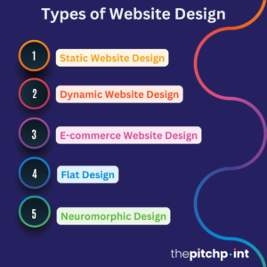
Types of Website Design

Website design varies based on the functionality, purpose, and aesthetic goals of a website. Below, we’ll explore each type of website design, highlighting its unique characteristics and ideal use cases.
Static Website Design
A static website consists of fixed content. The web pages are pre-built and display the same information to every visitor, regardless of who they are or how they interact with the site.
Key Features:
- Fixed Content: The content does not change unless manually updated by the developer.
- Simple to Develop: No server-side scripting or database is needed.
- Fast Loading: Minimal resources are required to render the page.
- Low Maintenance: Ideal for websites that don’t need frequent updates.
Use Cases:
- Personal portfolios
- Company informational pages
- Small business websites
Example: A consulting firm’s website displaying its services, team, and contact information without any need for frequent updates.
Dynamic Website Design
A dynamic website simply is interactive and the company can make changes (without the help of a developer) on its content based on user inputs or other variables. These websites are designed in way that users can change the content, images, icons etc., as per their requirements, without need of an expert.
Key Features:
- Interactive Elements: Users can interact with the site (e.g., submit forms, log in, comment).
- Database-Driven: Content is often stored in a database and retrieved dynamically.
- Custom Experiences: Content changes based on user preferences or actions.
- Regular Updates: Can easily display fresh content without manual updates.
Use Cases:
- Social media platforms
- News websites
- E-learning platforms
Example: A news website that updates articles daily and tailors content recommendations based on the user’s reading history.
E-commerce Website Design
E-commerce websites are designed for online buying and selling. They prioritize seamless user journeys from product discovery to checkout.
Key Features:
- Product Catalogs: Showcase a variety of products with descriptions, images, and prices.
- Shopping Cart: Allows users to add and manage products before purchasing.
- Payment Integration: Secure options for online payments.
- Order Management: Tracks user orders, shipping, and returns.
- User Accounts: Enables customers to save preferences, track orders, and view purchase history.
Use Cases:
- Retail and wholesale businesses
- Subscription services
- Marketplaces
Example: Amazon, where users can browse products, add them to their cart, and complete purchases via multiple payment options.
Flat Design
Flat design is a minimalist style that focuses on simplicity and usability. It avoids any elements that look three-dimensional, like shadows or gradients.
Key Features:
- Simple Elements: Clean lines, geometric shapes, and bold typography.
- No Depth Effects: Avoids textures, shadows, and gradients.
- Bright Colors: Often uses vibrant and contrasting colors for visual appeal.
- Efficient Performance: The minimal use of graphics improves site speed and responsiveness.
Use Cases:
- Startups and tech websites
- Mobile-first applications
- Corporate and professional websites
Example: A software company’s website with large, colorful icons and straightforward navigation.
Neuromorphic Design
Neuromorphic design mimics real-world objects and their textures, creating a tangible interface. It blends realism with digital functionality, making UI elements appear as if they are part of a physical environment.
Key Features:
- Soft Shadows and Highlights: Creates the illusion of depth and elevation.
- Tactile Elements: Buttons and controls appear almost touchable.
- Futuristic Aesthetic: Combines realism with a sleek, modern feel.
- Enhanced Interactivity: Encourages users to engage with elements intuitively.
Use Cases:
- Experimental designs
- Technology-driven websites
- Apps emphasizing user interaction
Example: A fitness app where buttons for starting and stopping a workout resemble physical buttons on a device.
Minimalism Design
Minimalism emphasizes simplicity and clarity. The aim is to remove unnecessary elements and focus on what truly matters.
Key Features:
- Ample White Space: Enhances readability and reduces visual clutter.
- Simple Navigation: Focuses on a streamlined user journey.
- Limited Color Palette: Often monochromatic or uses minimal color to maintain a clean look.
- Clear Hierarchy: Prioritizes content with minimal distractions.
Use Cases:
- Luxury brand websites
- Personal blogs
- Professional service websites
Example: A designer’s portfolio showcasing work with simple layouts and plenty of white space to draw attention to their projects.
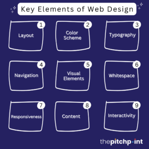
Key Elements of Website Design
Effective website design involves various elements to create a visually appealing, user-friendly, and functional website. Below are the core elements of website design:
Layout
The arrangement of visual elements on a page, including text, images, and navigation tools.
Key Aspects:
- Grid System: Aligns elements to create a balanced structure.
- Content Hierarchy: Prioritizes key information through size, color, or placement.
- Consistency: Ensures uniformity across pages for a cohesive experience.
Importance: A well-structured layout improves usability and guides the user’s eye through the content.
Color Scheme
The combination of colors is used throughout the website to create visual harmony.
Key Aspects:
- Brand Alignment: Reflects the brand’s identity and emotions.
- Contrast and Readability: Ensures text is easily readable against background colors.
- Color Psychology: Evokes emotions or responses (e.g., blue for trust, red for urgency).
Importance: Sets the mood and enhances the visual appeal of the site.
Typography
The style, arrangement, and appearance of text on a website.
Key Aspects:
- Font Choice: Use legible and appropriate fonts (e.g., sans-serif for modernity or tradition).
- Font Size and Weight: Establishes a clear hierarchy between headings and body text.
- Line Spacing: Improves readability by providing adequate space between lines.
Importance: Enhances readability and helps convey the brand’s personality.
Navigation
The system allows users to move through the website and access different pages or sections.
Key Aspects:
- Menus: Clear and concise main menus (horizontal or vertical).
- Breadcrumbs: Helps users track their location within the site.
- Call-to-Actions (CTAs): Directs users to take specific actions (e.g., “Sign Up,” “Learn More”).
Importance: Facilitates ease of use, ensuring users can find information quickly.
Visual Elements
This includes all imagery, videos, icons, and other graphical components.
Key Aspects:
- High-Quality Images: Enhances visual appeal and communicates professionalism.
- Icons and Illustrations: Simplifies complex ideas or adds character to the design.
- Videos and Animations: Engages users and conveys information dynamically.
Importance: Supports content, adds visual interest, and improves user engagement.
Whitespace (Negative Space)
The space around elements creates balance and avoids clutter.
Key Aspects:
- Enhances Focus: Draws attention to important elements like headings or CTAs.
- Improves Readability: Prevents content from feeling overwhelming.
- Aesthetic Appeal: Adds a clean, modern look to the website.
Importance: Provides breathing room for elements, improving overall design clarity.
Responsiveness
The ability of a website to adapt its layout and design to different screen sizes and devices.
Key Aspects:
- Mobile Optimization: Ensures a seamless experience on smartphones and tablets.
- Flexible Grids and Media: Adjusts elements like images and text to fit various screen resolutions.
- Touch-Friendly Navigation: Improves usability on touch devices.
Importance: Essential for delivering a consistent user experience across all devices.
Content
The text, images, videos, and other media convey information to the user.
Key Aspects:
- Quality and Relevance: Content should be valuable and aligned with user needs.
- SEO Optimization: Includes keywords, metadata, and structured content to improve search rankings.
- Clear Messaging: Ensures users understand the purpose of the site quickly.
Importance: Drives engagement and helps achieve the website’s goals (e.g., informing, selling, entertaining).
Load Time (Performance)
The rate at which a website’s pages load and are ready for user interaction.
Key Aspects:
- Optimized Images and Media: Reduces file sizes without compromising quality.
- Efficient Code: Minimizes unnecessary code for faster performance.
- Caching and Compression: Improves load times by reducing server requests.
Importance: Faster load times enhance user experience and improve search engine rankings.
Interactivity
Features that allow users to interact with the website, such as forms, buttons, and animations.
Key Aspects:
- Hover Effects: Visual changes when users hover over elements.
- Clickable Elements: Buttons and links that respond to user actions.
- Interactive Forms: Collect user input efficiently and intuitively.
Importance: Engages users and encourages actions like signing up or purchasing.
Best Practices and Considerations for Responsive Design
Responsive design ensures a website adapts seamlessly to all the devices and screen sizes, providing an optimal user experience. Below are key best practices and considerations to follow when implementing responsive design.
Use a Mobile-First Approach
Design for the smallest screen first, then scale up for larger devices. This ensures the most critical elements are prioritized for users on mobile devices.
Best Practices:
- Focus on essential content and features for mobile users.
- Gradually enhance the layout and design for larger screens.
- Use media queries to apply styles progressively.
Consideration: Starting small forces you to simplify, which improves usability across all devices.
Implement Fluid Grids
Use a grid system with relative units (like percentages) rather than fixed units (like pixels). This allows elements to resize proportionally based on the screen size.
Best Practices:
- Divide the layout into columns for flexible design.
- Set widths, margins, and paddings in percentages.
- Ensure grids adjust seamlessly on various screen sizes.
Consideration: Fluid grids maintain consistent spacing and alignment without breaking the layout.
Use Flexible Images and Media
Ensure that images, videos, and other media scale properly within their containers.
Best Practices:
- Use the max-width: 100% property to prevent images from exceeding their container’s width.
- Serve appropriately sized images for different devices.
- Consider modern formats for better performance.
Consideration: Overly large images can slow down load times on mobile devices, so optimize file sizes.
Optimize Navigation for Mobile
Navigation menus must be accessible and functional on small screens.
Best Practices:
- Use hamburger menus or collapsible navigation for mobile devices.
- Ensure touch targets (buttons, links) are large enough for easy tapping.
- Provide a clear and simple hierarchy of navigation items.
Consideration: Poor navigation can frustrate users, leading to higher bounce rates.
Prioritize Performance Optimization
Speed is critical on mobile devices due to limited bandwidth and slower connections.
Best Practices:
- Minimize HTTP requests by combining CSS and JavaScript files.
- Enable browser caching and compression.
- Use a content delivery network (CDN) to serve assets faster.
Consideration: A responsive site can perform poorly if not optimized for speed, negatively impacting user experience and SEO.
Ensure Readability Across DevicesThe text should be legible and accessible on all screen sizes without zooming.Best Practices:
* Ensure adequate line height and spacing for easy readability.
* Avoid small font sizes; 16px is recommended as a base size.
Consideration: Readability directly impacts user engagement and retention.
Test Responsiveness on Real Devices
Simulating screen sizes in a browser is useful but doesn’t fully replicate real-world conditions.
Best Practices:
* Test on actual mobile devices, tablets, and desktops.
* Use tools like Chrome DevTools, BrowserStack, or Responsinator to preview on various screen sizes.
* Check for usability issues like touch responsiveness and loading speeds.
Consideration: Testing on real devices helps identify potential flaws that might be overlooked in simulations.
Maintain Consistent Branding
The design should retain a cohesive look and feel across all devices.
Best Practices:
* Use consistent colors, fonts, and imagery.
* Ensure your logo scales properly without losing clarity.
* Keep the overall tone and style of content uniform.
Consideration: A consistent experience reinforces brand identity and builds trust with users.
Final Thoughts
Website design is a necessary for any successful digital strategy. It’s not just about making a website look good—it’s about creating an experience that engages users, builds trust, and drives meaningful actions. By blending aesthetics with functionality and keeping user needs at the forefront, website design helps businesses build a strong digital presence and stand out in a crowded digital landscape.
Whether you’re developing a minimalist blog, a feature-rich e-commerce site, or a dynamic corporate platform, the principles of effective website design remain the same: clarity, consistency, and usability. Investing in quality website design services and partnering web development company helps attract visitors to your site and encourages repeat engagement. An effectively designed website is a valuable asset for meeting your objectives, whether it’s increasing brand awareness or driving conversions.
Ready to take your online presence to the next level? Contact Thepitchpoint today for expert website design services to showcase your brand effectively and engage with your audience. Let’s create a stunning website that stands out and drives results!

